

Exploring a labyrinth of data often means navigating through various variables, each holding potential insights. In this journey of discovery, understanding the interconnections between these variables becomes paramount. Enter correlations—an essential compass in the initial analysis phase, offering a window into these intricate relationships within complex datasets.
Before we delve into the hero of our exploration, the correlogram chart, let’s take a moment to illuminate the significance of correlations themselves.
The code to reproduce the charts in R is available here.
What is correlation?
A correlation coefficient, often denoted as ⍴, is a statistical measure crucial for uncovering the presence and strength of a relationship, particularly in a linear context, between two variables within a dataset.
This coefficient operates within a range from -1 to +1, portraying the intensity and direction of the relationship:
- A coefficient nearing +1 signifies a direct relationship: as one variable rises or falls, so does the other.
- Conversely, a correlation coefficient approaching -1 signifies an inverse relationship: when one variable ascends, the other tends to decline, or vice versa.
- Should the correlation coefficient hover near 0, it suggests a lack of linear relationship between the variables, although other types of relationships might still exist, as we’ll explore shortly.
Examining a “toy example”
To bring these concepts to life, here are several scatter plots depicting the interplay between two variables, with the x-axis representing one variable and the y-axis the other.
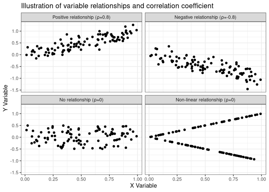
These crafted examples serve as a visual tour through diverse relationships, each distinctly mirrored in the correlation coefficient. The top two charts portray robust relationships: one exhibiting a strong positive correlation (top-left), while its counterpart showcases a pronounced negative correlation (top-right).
In contrast, the bottom-left chart displays a scatter of values devoid of apparent relationships, reflecting randomness along both axes. Yet, the intrigue deepens in the bottom-right plot: seemingly uncorrelated variables (indicated by a correlation coefficient near 0) actually share a fascinating relationship. Although not linearly correlated, the y-value is intricately tied to the x-value—either directly or inversely. Remarkably, a simple transformation (such as taking the absolute value of y) would elevate the correlation coefficient from 0 to 1, highlighting the limitation of solely relying on correlation coefficients for insight.
Despite this limitation, let’s delve deeper into our data using a correlogram to scrutinize these variables further.
Correlograms to the rescue
The correlogram emerges as a dynamic visual aid, swiftly unveiling the correlation coefficients among data features. Referencing our toy example, its visual representation paints a revealing picture:
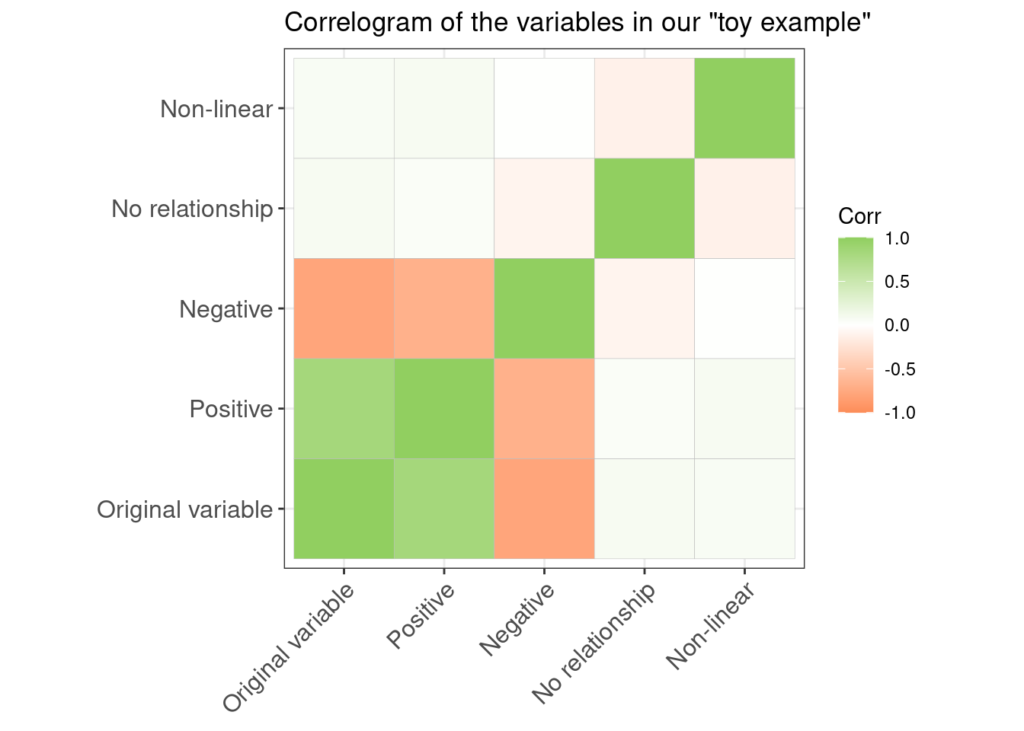
With this tool at our disposal, we swiftly decipher the intricate relationships between our primary variable and those displaying both positive and negative correlations. Additionally, the correlogram identifies two variables exhibiting low correlation, providing an instant snapshot of the data’s relational landscape.
Transitioning from our illustrative exercise, let’s pivot towards a captivating and real-world example: exploring the intricate relationships among movie genres. This exploration promises a more intricate and realistic portrayal of correlation dynamics within a diverse dataset.
Relationships of movie-genres
Delving into the vast realm of IMDb’s data trove, a particular gem catches the eye: a file with all IMDb’s recorded titles. This treasure trove houses a wealth of information, featuring titles intertwined with critical details such as release dates, runtime, and most intriguingly, associated genres. To make this data more manageable without sacrificing its essence, I’ve meticulously curated a refined version focusing solely on genres. Each title boasts a 0-1 coding system: a ‘1’ signifies a title’s association with a specific genre, while a ‘0’ denotes its absence.
This meticulous restructuring aims to distill the essence of genre associations within IMDb’s collection, setting the stage for a comprehensive exploration into the relationships and correlations among various movie genres. Buckle up as we unravel the intricate web of movie-genre dynamics!
Insights from the correlogram
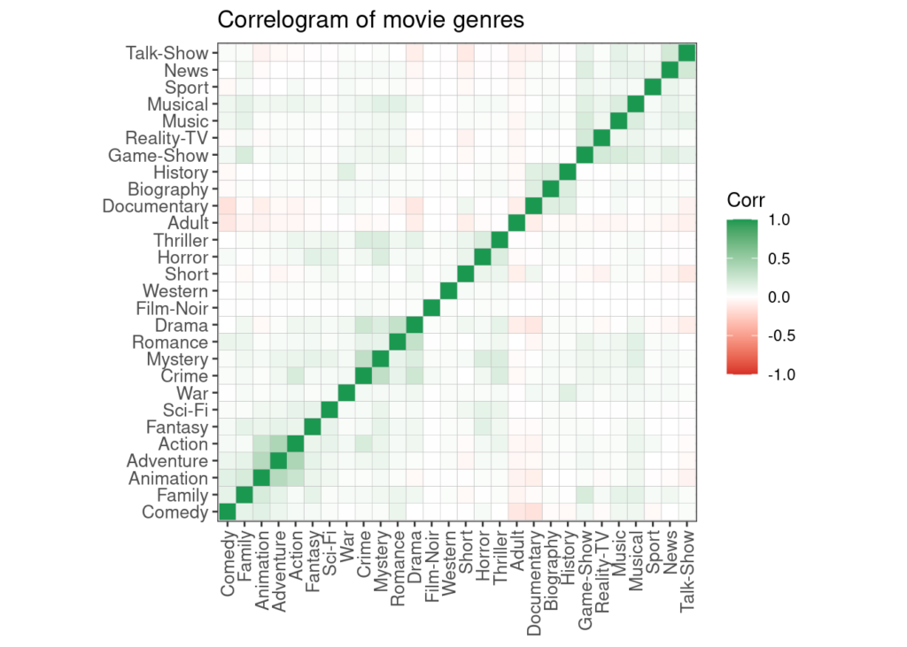
While exploring correlations among various movie genres, it becomes evident that outright strong relationships are rather scarce within the dataset.
The diagonal is strongly colored in green because the correlation coefficient of a variable with itself is always 1. Ignore the diagonal. Amidst this intricate web of genre associations, discernible positive relationships stand out prominently:
- Action, Adventure, and Animation: These genres showcase a noticeable connection, possibly owing to shared thematic elements or audience preferences for adventurous narratives.
- History, Biography, and Documentary: The trifecta of genres—rooted in reality and exploration of factual content—exhibit a notable correlation, hinting at common themes or storytelling approaches.
- Crime and Mystery: This association aligns with expectations, given the inherent intrigue and suspense shared by these genres in unraveling complex narratives.
- Romance and Drama: The emotional depth and human connections prevalent in both genres forge a strong positive relationship, reflecting shared thematic elements.
- Talk-shows and News: These genres, revolving around information dissemination and dialogue, surprisingly exhibit a positive correlation, possibly due to their similar formats or content delivery.
Moreover, intriguingly, negative relationships—opposites in nature—also emerge within our analysis:
- Adult vs. Comedy: The contrast between these genres could stem from their divergent content and target audiences, leading to a negative correlation.
- Documentary vs. Comedy, Drama: The disconnect between these genres, particularly with comedy and drama, hints at disparate storytelling styles or thematic content.
These nuanced relationships, both positive and negative, shed light on the diverse landscape of movie genres and their interplay within the film industry.
Conclusions
In this exploration, we’ve delved into the realm of correlations, unraveling the intricate tapestry of relationships that exist among variables within a dataset. From robust positive connections to intriguing negative associations and even instances of low correlation reflecting non-linear relationships, we’ve witnessed the diverse ways variables interact.
The power of correlogram charts has shone through as an invaluable visual aid, offering a swift and insightful glimpse into the complex web of correlations within extensive datasets. These visual representations serve as an initial compass, guiding us through the labyrinth of data by highlighting key relationships.
However, it’s crucial to recognize that correlograms are but the first step in this analytical journey. While they provide essential directions and surface-level insights, further in-depth research and analysis are often necessary. Correlograms pave the way for deeper dives, encouraging us to explore and uncover the nuanced intricacies hidden within the data.