

One of the important tools data scientists love using are data visualizations (i.e., graphs). You might be asking yourself why can’t we completely rely on descriptive statistics? Shouldn’t average, standard deviation, correlation be enough? well… they aren’t.
A recent paper by Justin Matejka and George Fitzmaurice, shows this very beautifully.
Matejka and Fitzmaurice synthetically created a data set with 13 sub-groups. Each subgroup has 142 observations, with an associated X and Y values. The average value of X in each group is about 54.3 and the average value of Y is 47.8.
The standard deviation of X is 16.8 and the standard deviation of Y is 26.9.
The X and Y variables are uncorrelated (they don’t have a linear relationship between them). The correlation is In each group is between -0.063 to -0.069.
All groups seem to have the same properties, right? Wrong!
If we plot the data, we see that there are definitely quite a few patterns to be discovered. For example a dinosaur!
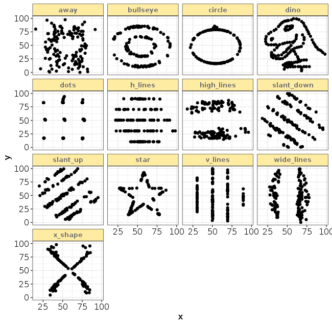
The lesson – always plot your data. The data science process includes multiple elements which we iterate through as we analyze data. Among them:
- Data transformations
- Data visualizations (graphing)
- Data modelling
We examine the data from various angles, and iteratively change our approach in order to improve our understanding. Simple descriptive statistics are a beginning, they are important – but they are not enough!